People Are Spotting a ‘Hidden Detail’ in the Coca-Cola Logo
Why Everyone Can’t Stop Talking About It (and What It Really Means)
Introduction:
For over a century, the Coca-Cola logo — that flowing, red-and-white cursive wordmark — has been one of the most recognized brand symbols on Earth. But recently, something curious has reignited public interest: people online are claiming they’ve spotted a “hidden detail” in the logo that most of us have walked past a thousand times without noticing. The discussion has gone viral on TikTok, Instagram, Facebook, and X (Twitter) — and it’s gotten many to rethink this familiar design.
In this article, we’ll take you through:
what the claimed hidden detail is
how people are talking about it online
the logo’s history and design background
what experts and skeptics say
why these kinds of “hidden message” theories trend
and what this means for Coca-Cola and branding more broadly.
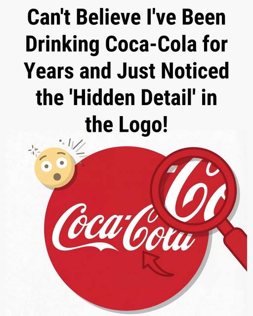
1. What’s the “Hidden Detail” People Are Spotting?
Specifically:
Observers claim that the curved flourish of the second “C” in Coca-Cola resembles a smile, a subtle curve that evokes happiness or joy.
Others have suggested that if you look carefully at various parts of the script, you can see shapes or patterns reminiscent of other symbols — but the smile interpretation is the one attracting the most attention right now.
Because Coca-Cola’s long-running marketing themes have often focused on happiness, joy, and positive emotion, many people now see this supposed “smile” as something more than coincidence — like a subliminal reinforcement of the brand’s messaging.
What People Share Online
Across social platforms:
Users post close-ups of the logo with arrows and highlights pointing to the curvature of the “C.”
Others make memes comparing the curve to a literal smile under the brand name.
In essence, the hidden detail isn’t a separate image or icon inside the logo — it’s a part of the letterform itself, which happens to resemble something else once you’re made aware of it.
2. A Logo With a Century of History
To understand why this is interesting — and why it matters — we need context.
Origins of the Coca-Cola Logo
The Coca-Cola logo was first created in 1886, designed by Frank M. Robinson, a partner and bookkeeper to Dr. John S. Pemberton, who invented the drink.
Robinson chose the Spencerian script style because it was both popular and visually distinctive in the late 19th century.
That swirling, flowing aesthetic has remained basically unchanged for over a century, becoming one of the most enduring wordmarks in commercial branding history.
Unlike logos that feature icons or symbols (like the arrow in the FedEx logo or the hidden bear in the Toblerone mountain), Coca-Cola’s logo is purely typographic — all about its letter shapes and curves. That means any “hidden detail” has to emerge from within the script itself.
And this is where the mystery and intrigue arise — especially now that people are seeing new patterns they hadn’t noticed before.
3. The “Smile Theory” and the Joy Connection
Among the various interpretations circulating, the most prominent is the “smile” inside the logo.
What People Are Seeing
Design commentators have pointed to the sweep of the extended curve of the second “C” — the way it arcs and flows under part of the wordmark — as resembling a gentle smile.
Some points supporters make:
The curvature’s shape is similar to a mouth smiling.
Coca-Cola’s long brand messaging ties to happiness and joy (think slogans like “Open Happiness”), making the perceived shape seem symbolically aligned with the brand.
This interpretation captures the imagination precisely because it blends visual form with emotional symbolism — something designers often hope to embed in strong brands.
Is the Smile Intentional?
Here’s where things get interesting: Coca-Cola itself has never officially said the logo intentionally contains a smile. That’s important.
Design experts — and even dedicated logo historians — point out that the company’s own archives make no mention of a deliberate smile shape hidden in the script.
In other words:
It’s possible people are seeing a smile because they’re trained to think about symbolism.
But there’s no official evidence that this “smile” was part of the original design intent.
Some critics and designers take this further and suggest that the smile interpretation may be retrospective pattern-finding rather than a purposeful design choice.
4. Other “Hidden” Interpretations Over the Years
The current smile observation isn’t the first time people have claimed there’s something hidden in the Coca-Cola logo.
Danish Flag Theory
Some design commentators have pointed out that the negative space between the letters in the Coca-Cola script can resemble the cross of the Danish flag.
According to some accounts, Coca-Cola even used this observation in promotional campaigns in Denmark — highlighting the coincidence as a way of celebrating local culture and happiness.
But again, the company did not originate the logo with that intention — it emerged retroactively after people noticed the visual similarity.
Viral and Meme Versions
Across social media and meme culture, other interpretations have popped up:
Some users make optical illusions by rotating or editing the logo.
Others claim humorous or bizarre shapes (like faces or objects) appear when looking at the letters from different angles.
These should be taken with a grain of salt — most are Pareidolia: the brain’s tendency to see patterns (like faces or figures) where none were purposefully placed.
5. Why Do People See Hidden Things in Logos?
It’s helpful to step back and ask: why do people do this? Why does a simple logo suddenly inspire curiosity and controversy?
There are a few psychological and cultural factors at play:
A. Pareidolia
Humans are wired to see patterns — especially faces, smiles, and familiar shapes — even in abstract forms. This is part of how our brains process visual information. Logos with curves and swirls invite this kind of interpretation.
B. Symbolism and Branding
Great branding often feels meaningful — and when an image seems to align with a brand’s core message (like happiness for Coca-Cola), people make those connections quickly and share them widely.
C. Social Media Amplification
In the age of TikTok, Instagram Reels, and viral Facebook posts:
a single person noticing something new can spread it worldwide in hours.
Users enjoy being the first to uncover something hidden.
Algorithms amplify content that triggers curiosity and “aha” moments.
These factors together can inflate a small observation into a global trend — even if the original detail wasn’t intentionally hidden.
6. What Experts Actually Say
It’s one thing for users to notice patterns, but what do design professionals and historians say?
Expert Views
Some branding experts acknowledge that you can interpret the extended “C” as looking like a smile — but they caution that this is a modern interpretation, not something proven to be intentional by the designers.
Other commentators argue that if Coca-Cola wanted a smile encoded in its logo, the company would have documented it — yet archives and official histories don’t reference any such design goal.
That doesn’t make the observation meaningless — it just means the symbolism people are seeing may be more about consumer interpretation than designer intention.
Skeptical Perspective
Design critics often point out:
Human brains seek patterns and meaning.
Logotypes developed before the era of social media weren’t usually built with hidden messages — especially not for Coca-Cola’s early script.
The existing interpretation may be fun and interesting, but it isn’t definitive proof of a secret design.
7. Why This Story Went Viral
There are a few reasons this particular observation spread so quickly:
A. Familiarity
Everyone knows the Coca-Cola logo — from billboards to vending machines to movie scenes. When you think you see something new in something so familiar, it catches your attention.
B. Emotional Resonance
The idea of a smile hidden in a logo that represents happiness fits neatly with Coca-Cola’s century-old marketing themes — which makes the interpretation feel true even if it isn’t officially confirmed.
C. Memetic Potential
The current social media environment loves:
quick twists (“you’ll never notice…”)
visual reveals (“look closely…”)
and participatory discovery (“pause and see it now!”)
These formats make people engage and share, driving rapid spread.
8. How Companies Use Hidden Messages (and When They Don’t)
Some logos do contain intentional hidden symbolism — like:
FedEx (arrow in negative space),
Continue reading…
